Google Material icons + 文字列で縦を揃える
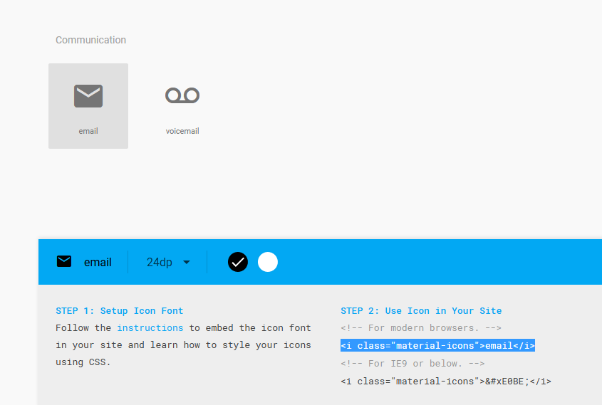
Google Material Iconsという、WEB制作の現場でアイコンを使いたいときに重宝するサービスが有ります。例えばお問合わせボタンの横にメールアイコンを表示したい場合等にとても便利です。
使い方は至って簡単で、GoogleのCSSを読み込ませ、ここからアイコン表示用のHTMLを取得するだけです。
<head>
<link href="https://fonts.googleapis.com/icon?family=Material+Icons" rel="stylesheet">
</head>
<i class="material-icons">email</i>
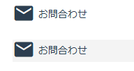
と、ここまではたくさんのサイトさんが解説しているのですが、実際の現場でリンク文字列の横にアイコンを配置してみると、文字とアイコンの下端が揃いません。
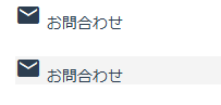
vertical-alignを使えばいいかな?と思ったのですが、それだけでは揃わず、Googleから読み込んでいるCSSを少し変える事で対応出来ました。
Googleから読み込まれるCSS
.material-icons {
  font-family: 'Material Icons';
  font-weight: normal;
  font-style: normal;
  font-size: 24px;
  line-height: 1;
  letter-spacing: normal;
  text-transform: none;
  display: inline-block;
  white-space: nowrap;
  word-wrap: normal;
  direction: ltr;
  -moz-font-feature-settings: 'liga';
  -moz-osx-font-smoothing: grayscale;
}
これのdisplay: inline-blockをdisplay: inline-flexに変更し、vertical-align: middleを指定します。
.material-icons {
  font-family: 'Material Icons';
  font-weight: normal;
  font-style: normal;
  font-size: 32px;
  line-height: 1;
  letter-spacing: normal;
  text-transform: none;
  white-space: nowrap;
  word-wrap: normal;
  direction: ltr;
  -moz-font-feature-settings: 'liga';
  -moz-osx-font-smoothing: grayscale;

  display: inline-flex;
  vertical-align: middle;
}
Bootstrapにも使いやすいアイコンが有るのですが、数的にはこちらの方が勝っていますね。
Bootstrapと言えば、数年前に私的マニュアルを作って公開しているのですが、バージョン上がってちょっと使えなくなっていますね・・・現行バージョンで書きたいんですが、中々時間が取れず。というより、歳のせいか集中力の低下とモチベーションの維持が難しいですね(汗